
How to Use Analyze Data in Excel 365: Step-by-Step Guide with Examples
- Sharon Rajendra Manmothe

- Aug 23, 2025
- 9 min read
If you want to quickly find patterns, trends, and insights from your spreadsheets, Excel’s Analyze Data tool (formerly known as “Ideas”) is a powerful feature built into Excel 365. In this blog, we’ll cover everything—from how to use Analyze Data in Excel 365 step by step to best practices for cleaning data before using Excel Analyze Data, along with real examples and screenshots.
1. What is the Analyze Data Feature in Excel 365?
The Excel Analyze Data feature uses AI to review your dataset and offer smart suggestions. It can:
Highlight patterns and trends
Suggest pivot tables and charts
Answer questions using natural language
This is ideal for users who don’t know advanced Excel functions or want quick data insights with Excel Analyze Data feature.
2. How to Use Analyze Data in Excel 365 Step by Step
Here’s a beginner-friendly tutorial:
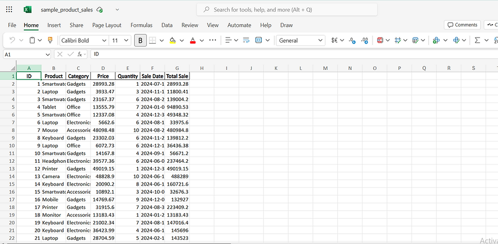
Step 1: Prepare Your Data
Ensure your dataset is in a clear table format.
Use descriptive column headers (e.g., Date, Product, Sales Amount).
Avoid blank rows or merged cells.
Step 2: Select Your Data
Click anywhere in your dataset or convert it to a table using Ctrl + T.
Step 3: Open Analyze Data
Go to Home → Analyze Data (on the right side of the ribbon).
A pane will open on the right.

Step 4: Ask Questions in Excel Analyze Data Pane
Type natural language questions like:
“Show total sales by product category”
“Which region had the highest sales in March?”
“Top 5 customers by revenue”

Ask Questions in Excel Analyze Data Pane
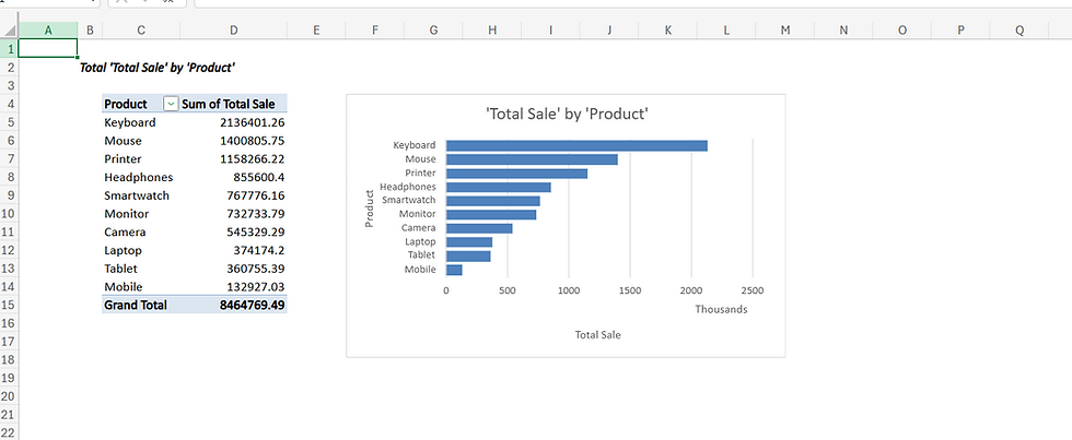
Excel instantly creates pivot tables, summaries, and charts based on your question.
Step 5: Insert Recommended Insights
Browse the suggestions.
Click Insert to add charts or pivot tables directly to your sheet.
Example: In one click, you can create a monthly sales line chart without writing a single formula.
3. Beginner Guide to Excel Analyze Data Feature
This tool is designed for anyone who wants fast answers. Even if you’ve never built a pivot table before, Excel Analyze Data vs pivot tables for beginners shows how easy it is:
Pivot tables require manual setup.
Analyze Data automatically generates visuals.

4. Best Way to Analyze Sales Data Using Excel Analyze Data Tool
Imagine you have a sheet of sales data with columns for Date, Region, Product, Quantity, Sales Amount. Instead of spending hours creating formulas, try:
“What is the average sales per month?”
“Which product sold the most in Q2?”
“Find anomalies in sales trends.”
The Excel 365 AI insights using Analyze Data explained through these examples make analytics simple and interactive.
5. Tips for Using Excel Analyze Data to Create Instant Charts
Use clean data with clear column names.
Ask focused questions: “Top 10 categories by sales” works better than “Tell me about my business”.
Combine with Excel’s chart customization to improve visuals.
6. Best Practices for Cleaning Data Before Using Excel Analyze Data
Remove duplicates: Data → Remove Duplicates
Format numbers and dates correctly.
Fill missing values if necessary.
Convert text numbers to real numbers using VALUE().
A clean dataset ensures the Analyze Data feature gives accurate insights.
7. Why Use Analyze Data Instead of Manual Analysis?
One of the most significant advantages of utilizing automation in data analysis is the substantial amount of time it saves for organizations and individuals alike. By automating the analysis process, repetitive and time-consuming tasks that would typically require manual intervention can be efficiently handled by software and algorithms. This automation encompasses various stages of data processing, including data collection, cleaning, and analysis, which traditionally consume a considerable portion of time and resources. Furthermore, automation not only accelerates the speed at which data can be analyzed but also enhances accuracy by reducing the likelihood of human error. Automated systems can execute complex calculations and data manipulations at a pace that far exceeds human capabilities, allowing analysts to focus on interpreting results and making informed decisions rather than getting bogged down in the minutiae of data handling. Moreover, automation tools often come equipped with advanced functionalities, such as machine learning algorithms and predictive analytics, enabling them to uncover insights that may not be immediately apparent through manual analysis. This deeper level of analysis can lead to more informed strategic planning and quicker responses to market changes. In addition, by freeing up valuable time, automation allows teams to allocate their resources more effectively. Analysts can dedicate their efforts to higher-level tasks such as developing strategies, conducting further research, or engaging with stakeholders, thereby driving greater value for the organization. Ultimately, the time saved through automation in analysis not only enhances productivity but also contributes to a more agile and responsive operational framework.
Beginner-Friendly with Intelligent Suggestions
In today's fast-paced digital landscape, the need for user-friendly interfaces and intelligent systems has never been more critical, especially for beginners who may feel overwhelmed by the complexities of technology. A platform that is designed to be beginner-friendly offers an intuitive experience, ensuring that users can navigate through its features with ease and confidence, regardless of their prior experience or technical knowledge. One of the key components of a beginner-friendly system is its user interface, which is often characterized by a clean, uncluttered layout that prioritizes simplicity. This design approach minimizes distractions and allows users to focus on the tasks at hand. Clear labeling of functions and features, along with guided tutorials or tooltips, can significantly enhance the learning curve for new users. These elements work together to create an environment where beginners can explore and learn at their own pace without feeling intimidated. In addition to a user-friendly interface, intelligent suggestions play a pivotal role in enhancing the overall experience for beginners. These suggestions can take various forms, such as contextual tips, automated recommendations, or adaptive learning pathways that adjust based on the user's interactions. For instance, when a beginner is attempting to complete a task, the system might provide real-time suggestions that guide them through the process, highlighting key steps and offering shortcuts that can save time and reduce frustration. Moreover, intelligent suggestions can also analyze user behavior and preferences over time, leading to a more personalized experience. For example, if a user frequently accesses certain features or content, the system could prioritize these options in future interactions, making it easier for the user to find what they need quickly. This level of personalization not only enhances user satisfaction but also fosters a sense of ownership and engagement with the platform. Furthermore, incorporating feedback mechanisms allows beginners to communicate their experiences and challenges. This feedback can be invaluable for developers, as it provides insights into common pain points and areas for improvement. By actively listening to users and iterating on the design based on their input, platforms can continually evolve to meet the needs of beginners more effectively. In summary, a beginner-friendly approach, complemented by intelligent suggestions, creates an ecosystem that empowers new users. By focusing on simplicity, personalization, and responsiveness, such platforms not only facilitate a smoother learning experience but also encourage users to explore and utilize the full range of features available to them. This ultimately leads to greater confidence and proficiency, enabling beginners to harness the power of technology in their daily lives.
Importance of Identifying Outliers and Trends
Identifying outliers and trends in data is a crucial aspect of data analysis that can significantly enhance decision-making processes. Outliers are data points that differ significantly from other observations in a dataset. They can indicate variability in measurement, experimental errors, or they might be indicative of a novel phenomenon that warrants further investigation. Recognizing these outliers is essential, as they can skew results and lead to misleading conclusions if not properly accounted for.
Spotting Outliers
When analyzing data, it is easy to overlook outliers, especially in large datasets. However, employing statistical methods and visual tools can help in detecting these anomalies. Techniques such as box plots, scatter plots, and z-scores can provide visual representations that highlight data points that fall outside the expected range. For instance, a box plot can visually display the interquartile range and highlight any points that are significantly higher or lower than the rest of the data. This visual cue can prompt further investigation into the causes of these outliers, which could uncover valuable insights or lead to necessary corrections in data collection methods.
Recognizing Trends
In addition to spotting outliers, identifying trends within data is equally important. Trends refer to the general direction in which data points move over a specified period. They can reveal patterns of behavior, shifts in demand, or changes in consumer preferences. By analyzing trends, businesses and researchers can make informed predictions about future events and adjust their strategies accordingly. For example, a consistent upward trend in sales data over several quarters may indicate growing consumer interest, prompting a company to increase production or expand its marketing efforts.
Tools and Techniques for Analysis
There are various tools and techniques available that can assist in the identification of both outliers and trends. Data visualization software, such as Tableau or Power BI, allows users to create interactive dashboards that can dynamically highlight anomalies and trends in real-time. Additionally, statistical software like R or Python libraries can perform complex analyses, providing deeper insights into the data. By utilizing these tools, analysts can more effectively interpret their findings, ensuring that significant outliers and emerging trends are not overlooked.
Conclusion
In summary, the ability to spot outliers and trends is a fundamental skill in data analysis that can lead to more accurate interpretations and better decision-making. By employing various analytical techniques and tools, individuals and organizations can gain a clearer understanding of their data, allowing them to respond proactively to changes and anomalies. This enhanced awareness not only improves operational efficiency but also fosters innovation and strategic growth in an increasingly data-driven world.
Great for Dashboards and Presentations
Dashboards and presentations serve as vital tools for conveying information, insights, and data in a clear and engaging manner. They are essential in various fields, including business, education, healthcare, and technology, where the effective communication of complex information can significantly impact decision-making processes and audience understanding.
Dashboards: A Comprehensive Overview
Dashboards are visual displays of key performance indicators (KPIs) and other relevant metrics that provide a quick and accessible overview of a particular area of interest. They are designed to present data in a simplified format, allowing stakeholders to grasp essential information at a glance. A well-constructed dashboard can facilitate real-time monitoring of performance, helping organizations to track progress, identify trends, and make informed decisions based on data-driven insights. The effectiveness of a dashboard lies in its design and functionality. It should incorporate various visual elements such as charts, graphs, and gauges, which can represent data in a more digestible form. For instance, pie charts can illustrate market share, while line graphs can depict sales trends over time. Additionally, interactive features such as filters and drill-down capabilities enhance user engagement, allowing viewers to explore the data in greater detail.
Presentations: Engaging Storytelling
On the other hand, presentations are structured formats for delivering information to an audience, often accompanied by visual aids such as slides, images, and videos. The primary goal of a presentation is to inform, persuade, or educate the audience about a specific topic. Effective presentations leverage storytelling techniques to engage the audience, making the information memorable and impactful. When creating a presentation, it is crucial to organize the content logically and coherently. Starting with a strong introduction that outlines the main points can capture the audience's attention. Following this, the body of the presentation should delve into each point with supporting data, examples, and visuals that reinforce the key messages. Concluding with a summary that reiterates the main takeaways can help solidify the audience's understanding and retention of the information.
Integrating Dashboards and Presentations
The integration of dashboards into presentations can significantly enhance the overall effectiveness of the communication. By incorporating live data visualizations from dashboards into slides, presenters can provide real-time insights that bolster their arguments and illustrate points with concrete evidence. This not only makes the presentation more dynamic but also demonstrates a commitment to transparency and data-driven decision-making. Moreover, the combination of dashboards and presentations allows for a more interactive experience. Presenters can engage the audience by inviting them to ask questions about specific data points or trends displayed on the dashboard, fostering a collaborative environment where ideas and insights can be exchanged.
Conclusion
In conclusion, both dashboards and presentations are indispensable tools for effectively communicating information. They serve distinct yet complementary purposes, with dashboards providing a quick overview of data and presentations offering a structured narrative to engage and inform an audience. By leveraging the strengths of each, individuals and organizations can enhance their ability to convey complex information clearly and effectively, ultimately leading to better decision-making and understanding.
8. Examples of Questions You Can Ask
“Total revenue by salesperson”
“Monthly growth percentage”
“Top performing product by profit margin”
Combine these with screenshots to make your blog visually appealing.
Final Thoughts
The Excel Analyze Data tool is perfect for anyone who wants to turn raw spreadsheets into powerful insights quickly. By following this guide, you can save time, improve accuracy, and impress your team with professional-looking charts and reports.
Ready to try it? Open your Excel 365, follow these steps,

$50
Product Title
Product Details goes here with the simple product description and more information can be seen by clicking the see more button. Product Details goes here with the simple product description and more information can be seen by clicking the see more button

$50
Product Title
Product Details goes here with the simple product description and more information can be seen by clicking the see more button. Product Details goes here with the simple product description and more information can be seen by clicking the see more button.
$50
Product Title
Product Details goes here with the simple product description and more information can be seen by clicking the see more button. Product Details goes here with the simple product description and more information can be seen by clicking the see more button.


Comments